Tree Board View
This view shows transitions of items between statuses and takes into account the whole activity log of items (i.e. all historical transitions). Each transition creates a new "level", which is visulised as a column on the graph.
Multiple transitions and Statuses can create complex graphs, so you can pan and zoom to get a good view of interesting fragment.
Configuring your process
Process is defined by Statuses from selected Status Column. Order of statuses is not important (since all transitions will be shown as they occurred in historical order), unless you want to limit what transitions are shown between specific Statuses.
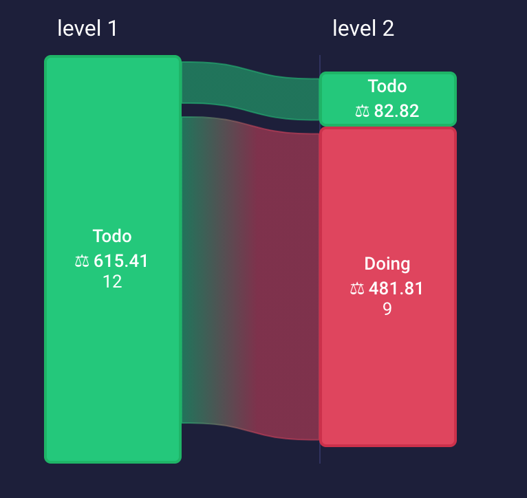
For example, you may have items starting in Todo (green) and Doing (red) Statuses as below:
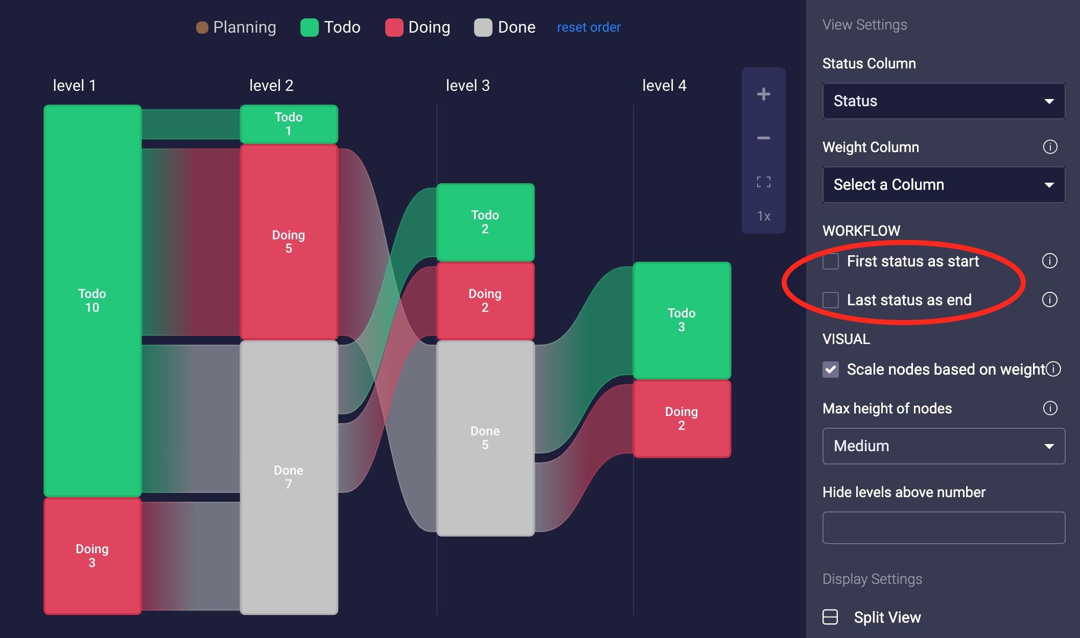
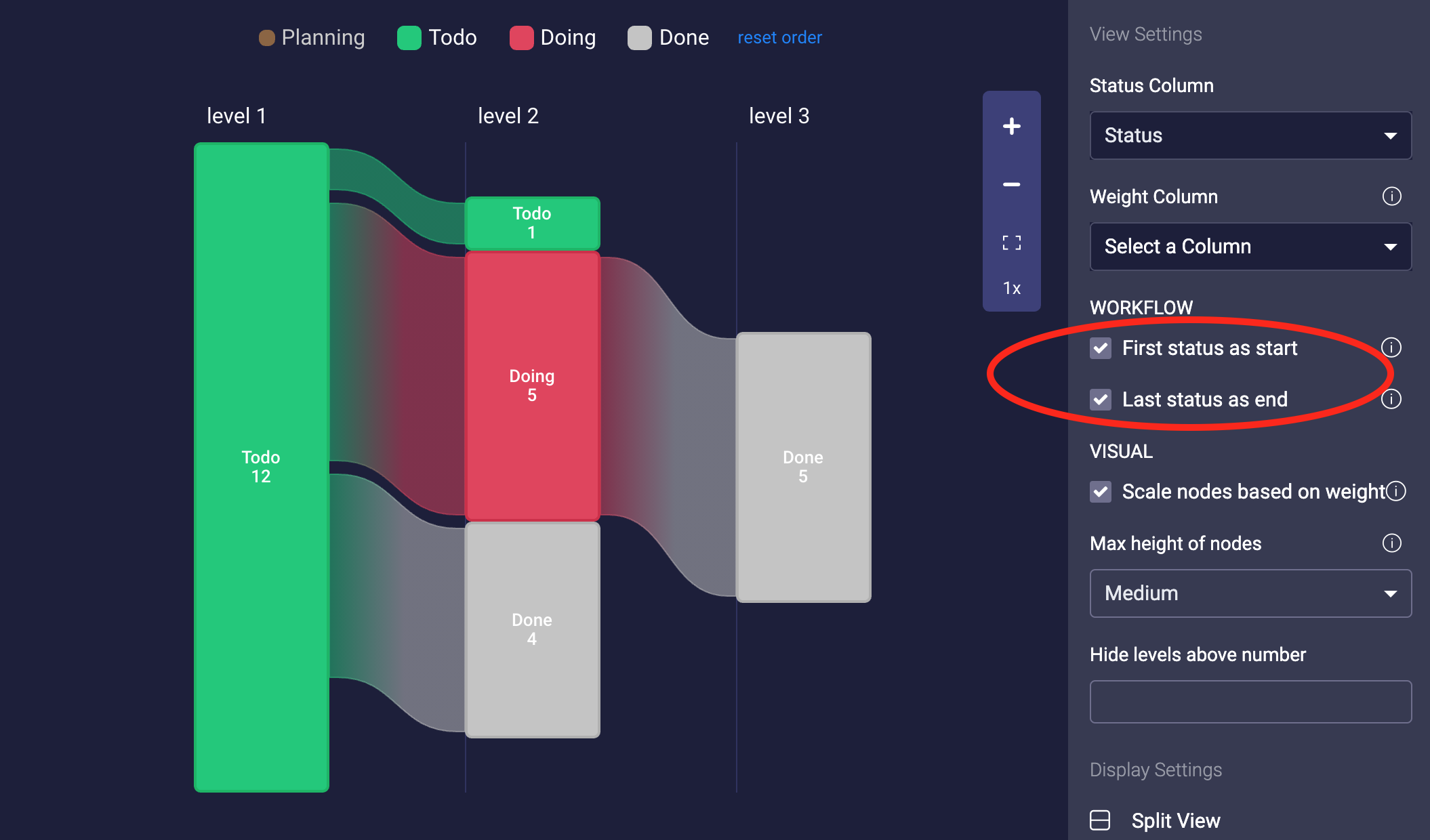
If you're only interested in the flow between Todo and Done, you can use First status as start and Last status as end options. Graph will then only track transitions starting with Todo (as this is the first Status) and Done (as this is configured as the last Status).
Customise order of Statuses
- Select Status Column in View Settings
- Reorder Statuses if the default order is not correct by dragging and dropping. Click reset order to restore default order.
- Enable or disable Statuses you're interested in by clicking Status labels

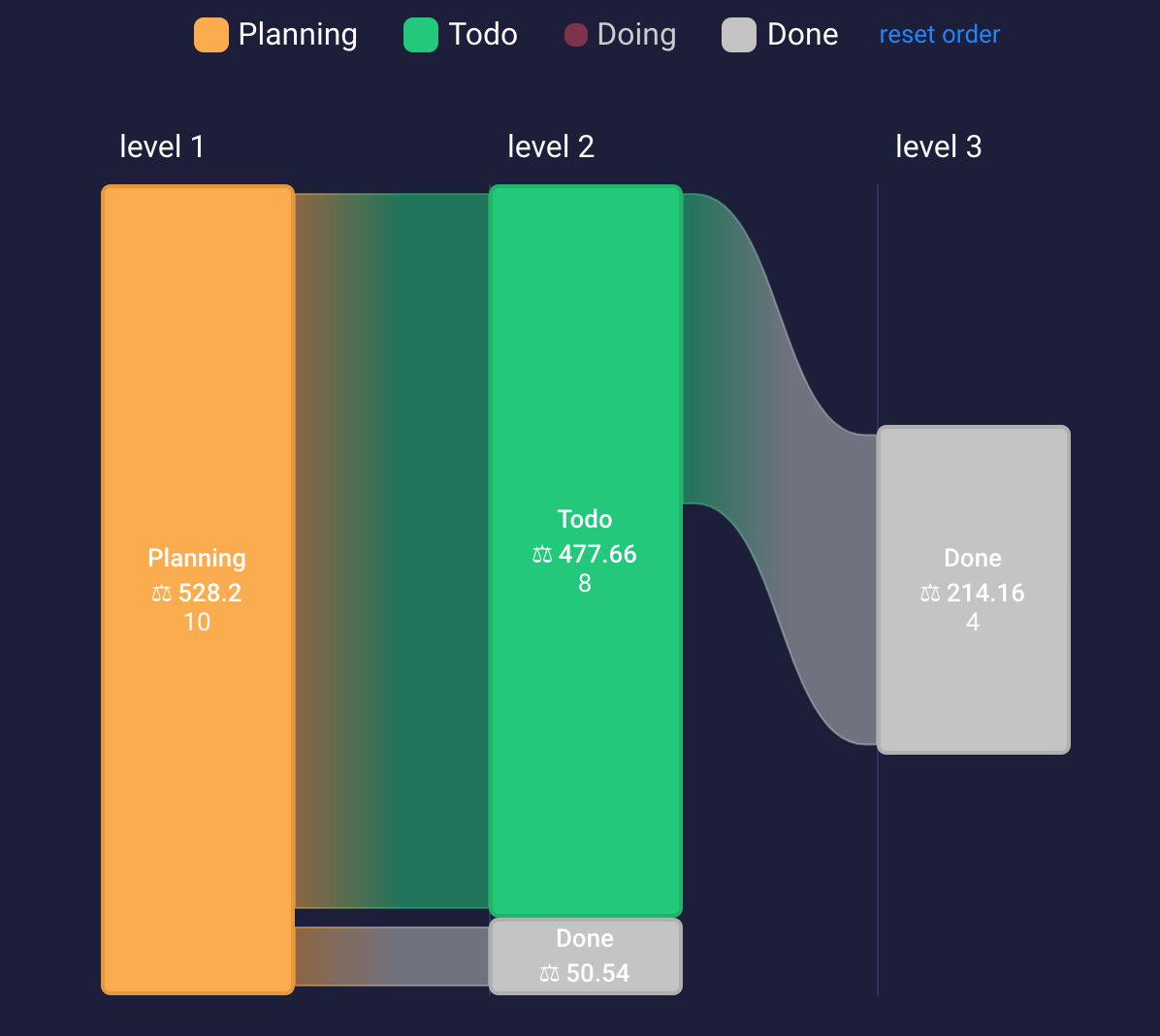
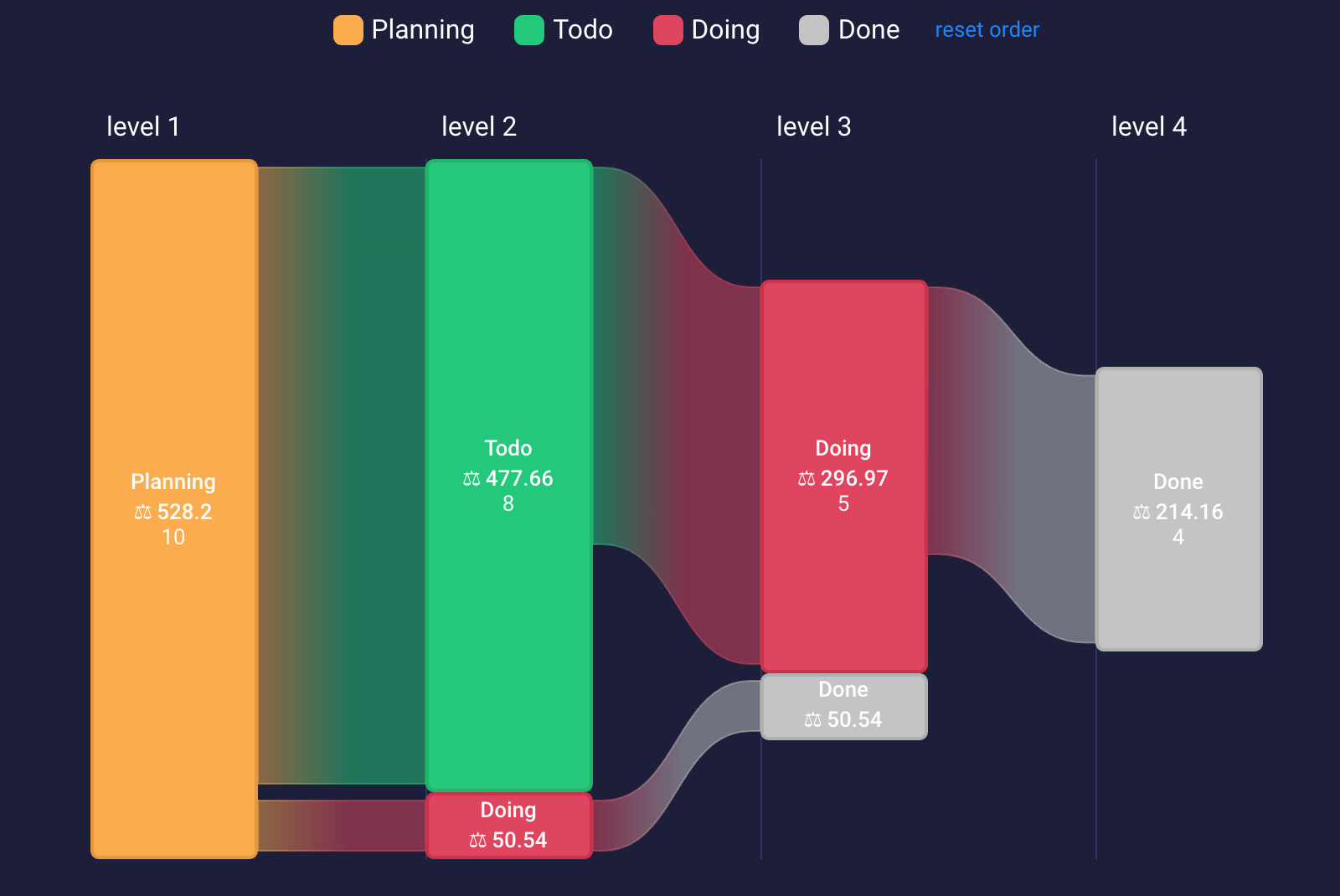
Only enabled Statuses will be taken into account when calculating graph. The more Statuses are selected the more complex the graph will become. You may disable all non essential Statuses to get clearer picture of what has happened. For example here's graphs produced for 2, 3, and 4 selected Statuses:
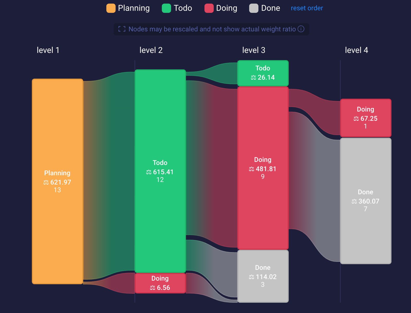
Weights
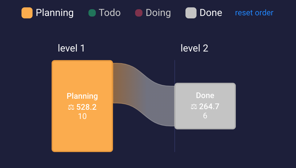
In case you want to visualise other properties of your items instead of count of items, you can choose Weight Column.
Weight Column can be any Numerical or Formula column (if it produces a number as a result). You can read more about column types in monday.com documentation.
Nodes will be scaled relative to the value of sum of all weights. This may produce difficult to read graphs in case of ratio of smallest to largest value being very high. Read on to learn how to prevent this.
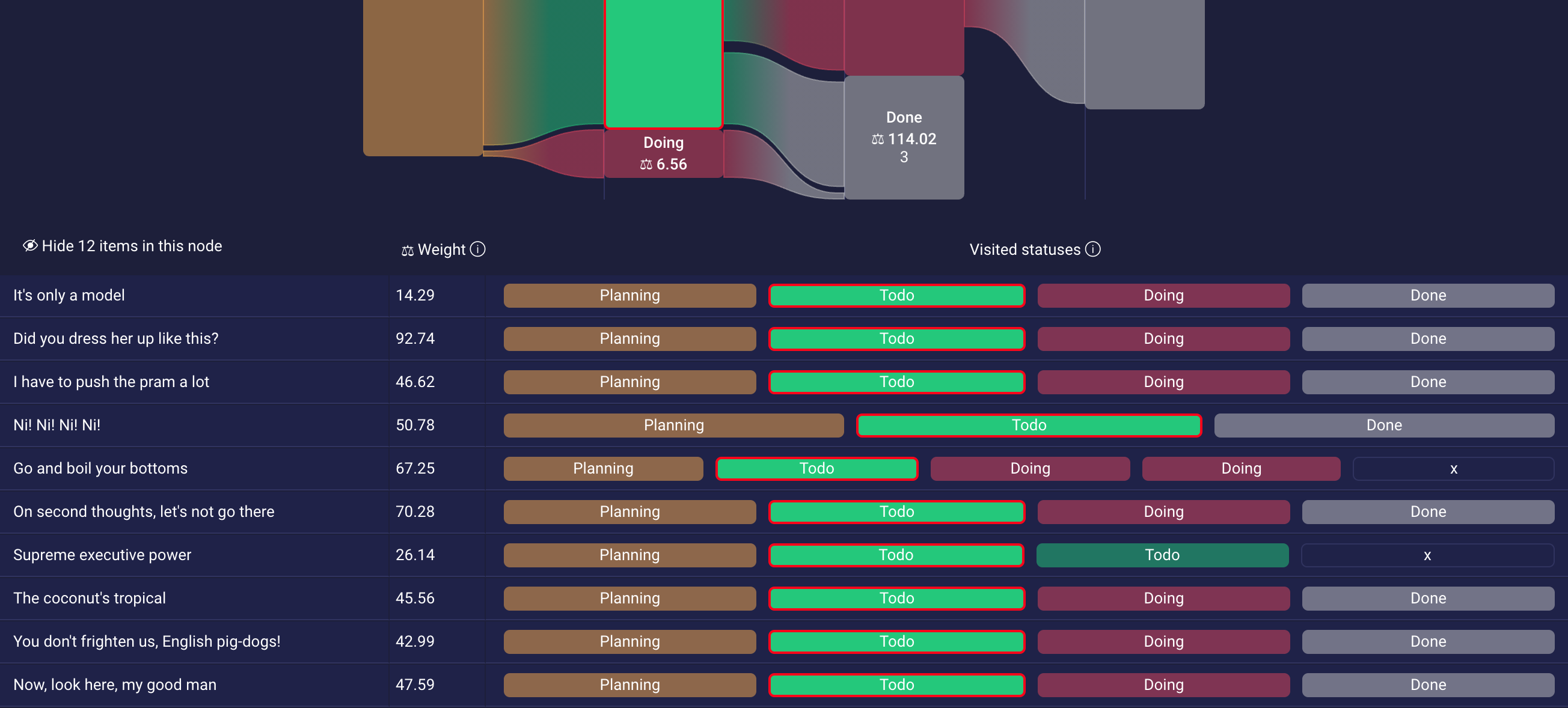
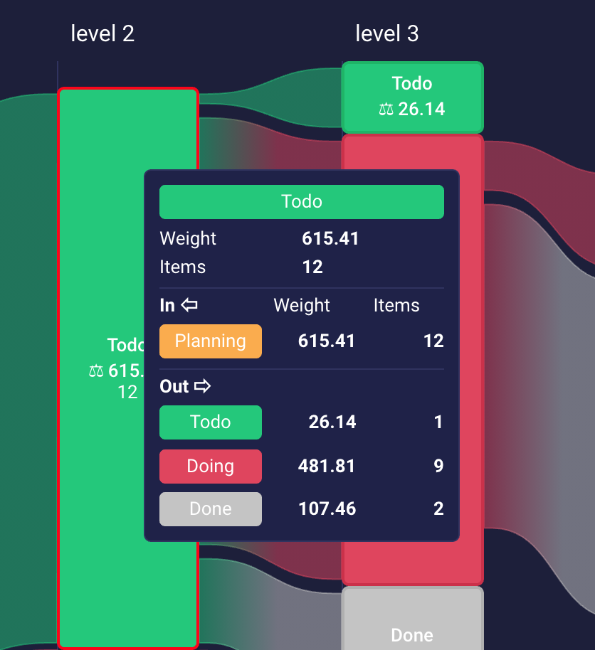
Select any node by clicking it to see values of Weights as well as assumed history of Statuses for each item.
Visualising large graphs
If there is large number of items or weights vary wildly, you may end up with a difficult to read graph with very high and small nodes:
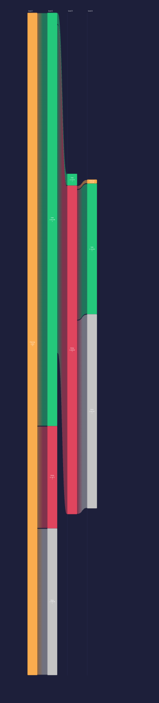
In that case you can use Max height of nodes View Setting to scale back the largest nodes. Node sizes will be relatively bigger or smaller, but relative sizes won't be accurate. E.g. node with weight 1000 will be bigger than node with weight 10, but it won't be 100 times bigger.
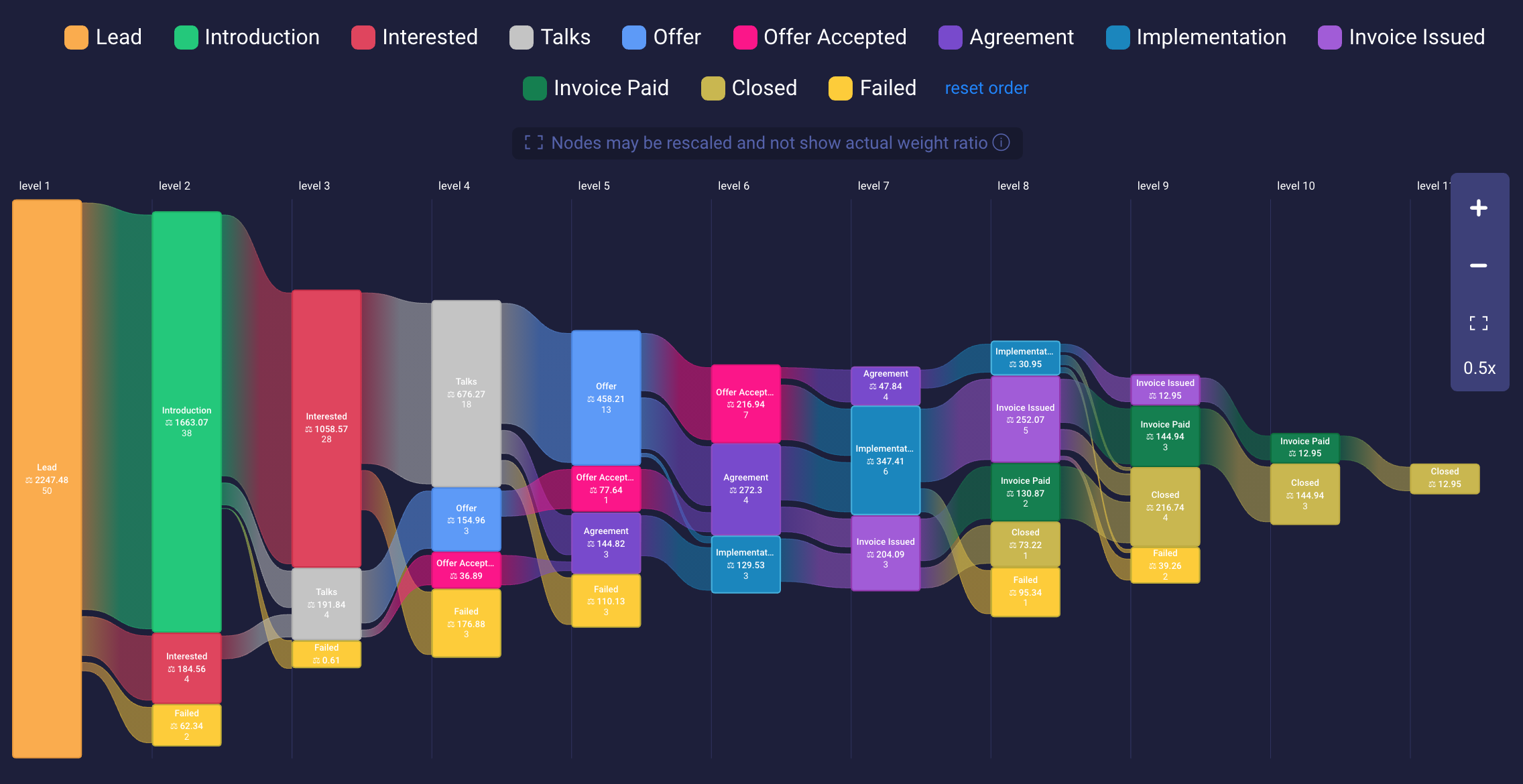
If any node has been rescaled, a warning visible in the below figure will show: "Nodes may be rescaled and not show actual weight ratio.".
More details for nodes
Hovering over any node shows tooltip with details count and weight of items in the node as well as incoming and outgoing transitions (Statuses, counts and weights).
Filtering
This view respects global filters for boards. Changing the filter will automatically recalculate and redraw the graph only for selected items.